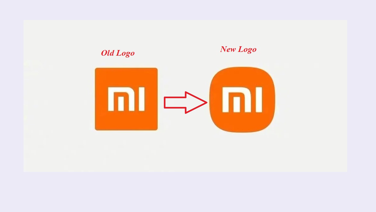
Chinese smartphone maker Xiaomi has recently announced a new logo. The new logo is now a curved-edge “squircle” rather than just a square.
A logo is basically an image of a brand that creates a memorable impression on consumers. Of course! 2020 was the year where we saw a number of brands coming out with new logos, ranging from the successful to the downright baffling. In today’s changing environment of the business world, brands now are finding a dire need to rebrand their identity by adopting new logo designs. After Myntra, Amazon, and Google, it’s now Chinese mobile giant Xiaomi who found it important to change its logo design.
Yes! You heard that right. Chinese smartphone maker Xiaomi has recently announced a new logo to refresh its new corporate visual identity. But there’s an important point to note that though Xiaomi has replaced its old logo, but trust me, you will have no trouble in recognising the new logo. Certainly, because the new logo looks exactly similar to the old logo. Maybe this was the reason that the company spent more than 20 minutes just to describe the new logo.
Xiaomi while unveiling its new foldable Mi Mix Fold announced the new logo. The new logo is pretty similar in appearance to the old logo and turned its old square design into a squircle (halfway between a square and a circle).
Old logo Vs New logo:
Xiaomi’s logo is now a curved-edge “squircle” rather than just a square. Although the company’s CEO Lei Jun said that changing the logo wasn’t simply a matter of “the shape from square to round”. Not at all, instead, it took the company a considerable amount of time to pick the right shape for their brand. The company has been working on the new logo since 2017 and believes that the new logo symbolises and reflects “the meaning of life”.
Xiaomi CEO Lei Jun explained the logo by saying that the company “didn’t just change the shape from square to round” but also changed “the internal spirit as well as the mentality of the brand.” Through this rebranding Xiaomi is trying to strengthen the company’s foothold in the premium market, simultaneously raising brand awareness among its audience through the new dynamic logo.
The logo has been designed by a world-renowned designer, professor of Musashino Art University, and the President of the Nippon Design Centre (NDC), Kenya Hara. The company believes that the new logo is more aesthetically pleasing as compared to the older one. Also. The colour orange continues with the logo to convey the liveliness and youthfulness of Xiaomi.
Remember, the ‘Made in India’ banner by Xiaomi:
Last year, the Chinese smartphone company Xiaomi made headlines by putting huge banners screaming ‘Made in India’ outside its Mi-Store showrooms in Kolkata. This strategy by the company was aimed at countering the growing chorus to boycott Chinese products. It was in June last year when the brand posters of Xiaomi were replaced by ‘Made in India’ banners written in white on a saffron backdrop, similar to the original colour scheme of the brand logo.
Xiaomi has used strategies in past to maintain its brand value and popularity in the market. This redesigning of the logo is also an initiative to broader its hold in the market and increase brand awareness among the consumers.

